Pride Flag & Banner Colors: What They Mean and How to Use Them
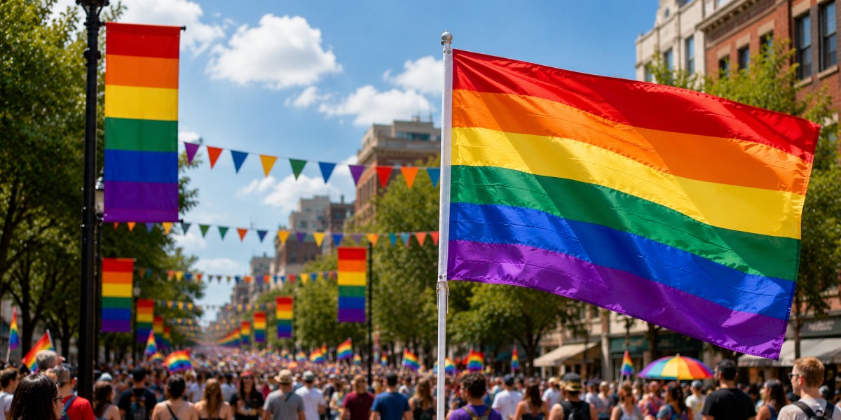
Walk past any Pride parade and your eyes go straight to the colors before anything else. It's almost a reflex. Red, orange, yellow, green, blue, violet - in that exact order, every time.
But here's what most people designing Pride displays don't fully think about: those colors weren't picked because they looked good together. Each one was assigned a meaning. And knowing that changes how you work with them.
The backstory - and why it still matters for design
Gilbert Baker was a self-taught artist living in San Francisco when he made the first Pride flag in 1978. Harvey Milk, the city's newly elected supervisor and one of the first openly gay politicians in the country, had pushed him to create something. Not a protest symbol - something that felt like a declaration.
Baker landed on a rainbow. Not randomly. Rainbows already meant something to people: hope, the end of a storm. He wanted that same energy attached to a community that had mostly been defined, publicly at least, by what it was fighting against.
The original flag had eight colors. Hot pink, red, orange, yellow, green, turquoise, indigo, violet. Each one was given a specific meaning: sex, life, healing, sunlight, nature, art, serenity, spirit. Volunteers hand-dyed the fabric and hand-sewed the flags. They debuted at San Francisco's Gay Freedom Day Parade on June 25, 1978.
The version we have now - six stripes - happened because of supply chain problems, not ideology. Hot pink fabric was nearly impossible to get in bulk. Turquoise got dropped so the flag could hang symmetrically on both sides of a city street. Indigo became plain blue. Practical fixes, made in the year or two after the original, that ended up being permanent.
That's worth holding onto when you're designing. The flag wasn't handed down from somewhere - it was made by people solving real problems.
What each color actually means
Red sits at the top and stands for life. It's also the most visually aggressive color in the sequence, which is why it leads. In a large rainbow pride banner, red is usually the first thing your eye catches, especially outdoors in natural light. Works well as an accent or a headline color. Gets muddy fast in low-resolution files, so watch your DPI if you're scaling up.
Orange is healing. Warmer than red but less sharp - it reads more like warmth than urgency. The catch with orange in print: it shifts more than almost any other color depending on the material. What looks right on screen can come out closer to rust on certain fabrics, or almost neon on vinyl. If your design is orange-heavy, get a physical proof before you commit to a full run.
Yellow means sunlight. Lightest value in the whole sequence, which is both its strength and its problem. On white or cream backgrounds, yellow practically disappears. In Pride designs, it tends to work better as an accent than as a field color. Text on yellow is almost always a mistake unless you're using very dark, heavy type.
Green is nature, and it sits in the middle of the flag for a reason - it's the visual resting point. Your eye wants to settle there. Green is also the most forgiving color to pair with other things, which makes it useful when you're integrating Pride colors into a design that already has a brand palette to think about.
Blue replaced indigo for practical reasons, but it kept the same meaning: serenity. There's also something that happens with blue in design that doesn't happen with other colors - people tend to trust it. Across almost every culture where this has been studied, blue reads as steady, reliable, safe. For a Pride display that's meant to signal welcome rather than provocation, that quality is actually useful.
Violet closes the sequence and represents spirit. It anchors the bottom of the flag with weight. In layout terms it's a natural stopping point - the visual period at the end of a sentence. It's also the most immediately
recognizable color in the rainbow sequence, which sounds counterintuitive but is true: when people see violet at the base of a colored stripe design, they know exactly what they're looking at.
The Progress Pride Flag - a different palette entirely
The six-stripe rainbow is the classic, but it's not the only version showing up at events anymore.
Daniel Quasar's Progress Pride Flag, released in 2018, adds a chevron on the left side with five colors that weren't in the original: black and brown (representing LGBTQ+ people of color), and light blue, pink, and white pulled from the transgender flag. A 2021 update included a yellow triangle with a purple circle for the intersex community.
For designers, the Progress flag introduces a few things worth noting. The chevron creates movement — it points right, and that directionality is built into the design on purpose. It also means you can't just scale the flag as a background tile the way you might with the standard rainbow, because the chevron position matters. The black and brown stripes are also darker in value than the rainbow colors, so they read differently in print, especially on fabric.
If an organization or event specifically asks for Progress Pride imagery, make sure you're working from accurate reference files. The proportions and color values matter more here than with the standard flag.
Using these colors in actual banner and flag design
There are a handful of things that consistently trip people up.
The stripe order isn't flexible. Red on top, violet on bottom - that's the sequence. Flipping it, or rearranging stripes for aesthetic reasons, produces something that most people will immediately read as wrong, even if they can't say exactly why. The order is too well-established to play with casually.
Equal stripe widths are the standard. Baker's original design used stripes of equal height, and that proportion has stuck. Unequal stripes don't look intentional - they just look like a mistake.
Screen versus print is a real gap. Colors shift between digital files and physical materials more than most people expect, and Pride colors - particularly yellow, hot pink (in Progress designs), and violet - shift more than average. The same hex value will look different on a knit polyester flag, a vinyl outdoor banner, and a fabric indoor display. If you need the colors to be consistent across multiple formats, get samples from your printer before ordering.
Text placement needs thought. Placing copy directly on rainbow stripes is harder than it looks. White text over yellow disappears. Most colors over red fight each other. The cleanest solution, almost always, is to run text on a separate white or black bar rather than on top of the rainbow. If you have to place text on the stripes themselves, test it at final print size before you approve anything.
File resolution at scale matters more than people realize. A design that looks clean at 5x5 inches can fall apart when it's printed at 3x6 feet. Work at 300 DPI from the start - or if that's not possible because of file size, 150 DPI minimum at the actual print dimensions. Enlarging a low-res file to fix this later never works.
How to think about Pride colors when you're representing a brand
This is where a lot of businesses make the same mistake. They take their logo, add a rainbow behind it, call it a Pride display.
The result usually looks like neither thing. Not a Pride display, not a brand display - just two things in the same frame that don't belong together.
The businesses that pull it off tend to use the rainbow as one element within a design, not as the design itself. A rainbow stripe along the bottom of a storefront banner with the brand above it. Rainbow-colored lettering in the brand's own font on a white field. A rainbow pride banner displayed separately, next to brand signage rather than fused with it.
There's also the durability question, which doesn't get talked about enough. Pride Month is June. June in most US cities means direct sun, heat, and often humidity. Yellow and hot pink - two of the colors that fade fastest under UV - are both prominent in Pride palettes. If a display needs to last four weeks outdoors, the material and ink type matter as much as the design. UV-resistant inks and outdoor-rated fabrics aren't optional for anything that's going to be in direct sunlight for a month.
One thing before you order anything
The rainbow has been in use for almost fifty years. People recognize it without a label, without context, without explanation. That recognition is genuinely useful in design - you get a lot of communication done before a single word is read.
But it also means the colors carry weight. A rainbow flag banner outside a business says something specific. Most organizations using them in June know that, and it's exactly what they want to say.
If you're ordering a custom rainbow pride banner for an event, a storefront, a school, or a community space - the things that actually make a difference are simpler than most people expect. Get the color sequence right. Match the material to the environment. Make sure anything you need people to read actually has enough contrast to read.
The rest is just execution.